Web design
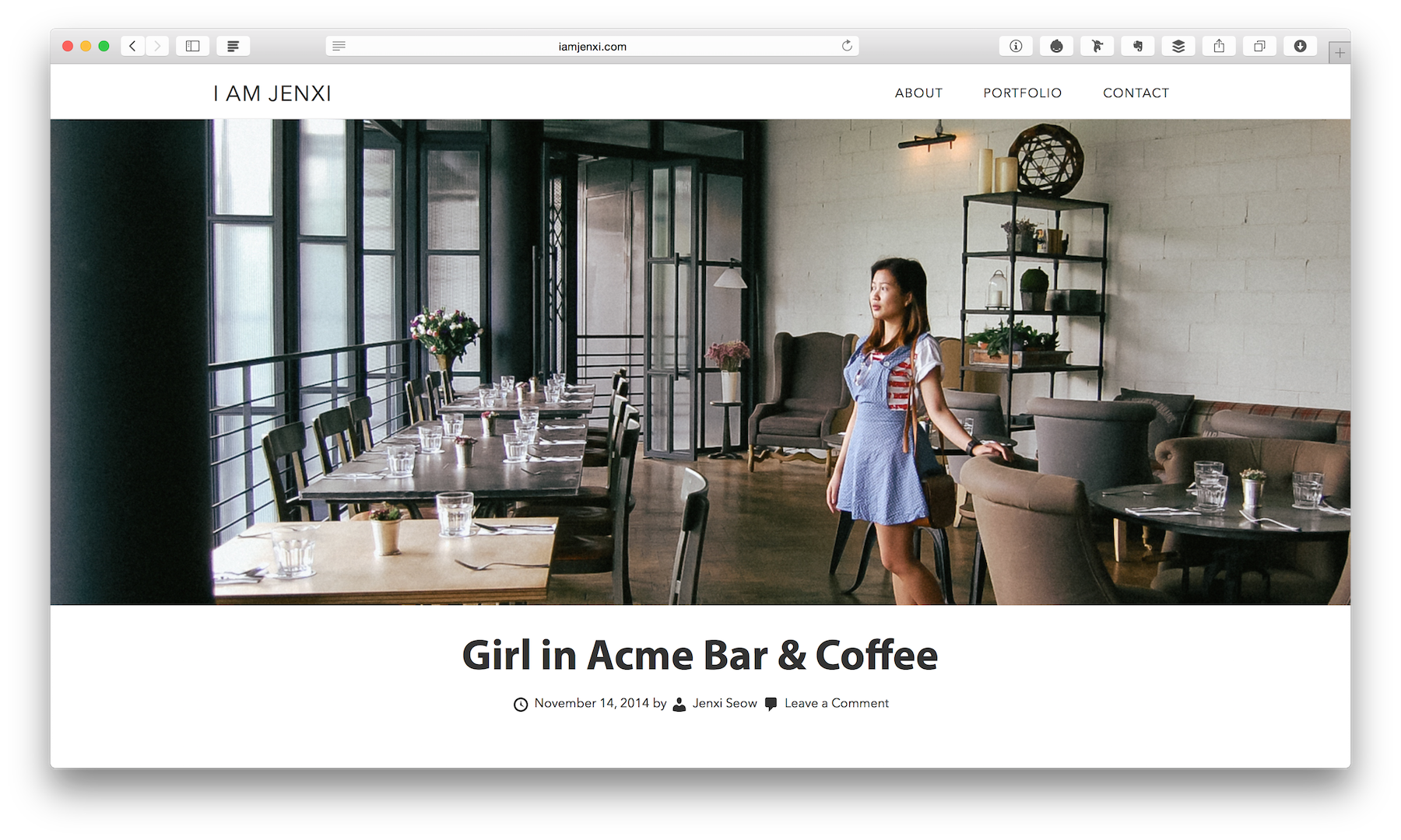
Moved to jenxi.com
I moved my blog to jenxi.com at the close of the 20th anniversary of this blog.

Website redesign for 2022
2022 marks the 20th anniversary of this site. I redesigned the site to celebrate the milestone.
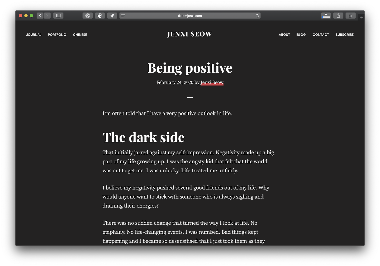

Dark mode
If you have dark mode or night mode enabled on your desktop or mobile browser, you’ll be able to see the effect on this site.

Web design
I have been doing web design since 1998.

Full-width theme design
I have adopted a full-width theme design for my blog.
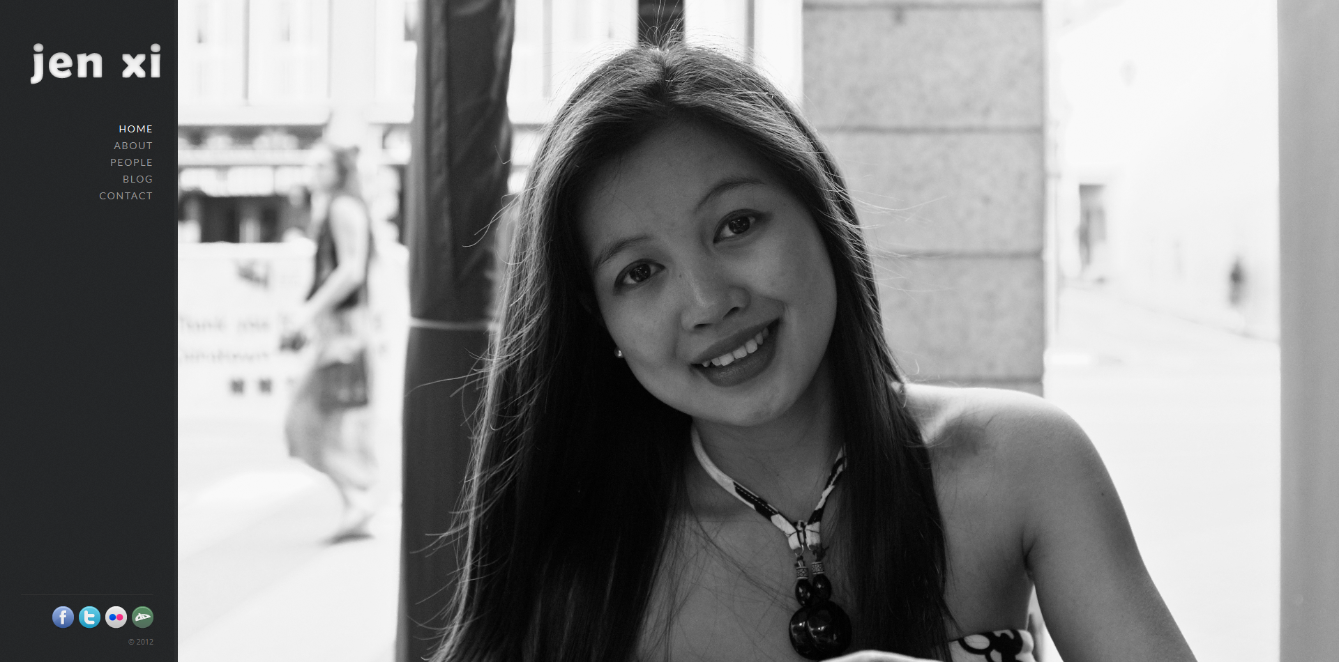

Portfolio – Photos by Jen Xi
My portfolio site is finally live. I have been fiddling around with several set ups but I’m proud to announce its official launch.