If you have been following my blog in recent weeks, you would have noticed the transition to a full-width theme design. I have been holding off making the switch because of the amount of work needed to implement it.
I previously went with large images for greater visual impact without going for a full blown edge to edge look. Full-width images would mean that photos in the portrait orientation would take up too much vertical space. However, once I figured out how to fit two portrait images side by, and thus effectively restricting the height, it was only a matter of time before I made the leap to using full-width images.
Diptych dilemma
The option of arranging portrait photos in a diptych had always been available. I was simply unwilling to go through the hassle of manually processing the images with Photoshop. Even the automation provided by Photoshop Actions did not tempt me down that road. Yes, I’m lazy. But I had another reason for not baking the diptych as a single image. By presenting two portrait photos side by side in a single image, it would be an awful experience viewing the photos on mobile. The current method of arranging the images by CSS allows me to provide a fallback via media queries for smaller screen sizes. On smaller screens, the diptych becomes a single column of images. Yes, readers can pinch to zoom on their mobile devices but if they had to do that, it means that the responsive design is bad.
Another obstacle to a full-width design is the need to manually wrap my text with HTML tags to make the design look right. Now that I blog in MarsEdit, the app highlights syntax, making it a lot easier to work with HTML and Markdown in my entries.

I have also switched to a font I really love: Avenir Next. Apple devices come with Avenir Next so you will be able to enjoy the beauty of this exquisite font. If you are rocking a Retina device, you would get to enjoy the slickness of this well-designed font. Unfortunately for those on non-Apple devices, unless you have the font installed, your browser will fall back onto the Google Font Muli, which is close enough but it’s no Avenir Next.
For those of you who are wondering, the previous main font was Lato from Google Font. Although the thin Lato font looks great on Retina screens, it renders poorly on screens with less pixel density. Avenir Next is more balanced, giving you the best of both worlds on Retina and non-Retina screens.
Good typography was something I kept firmly in mind when going into the design, since I want to post more text-only entries. The old design used justified text. I admit having a preference for full justification because my OCD makes me want to see the text aligned in a clean line along the margin. However, I have since relaxed on that stance because fully justified text can cause gaps called rivers of white, more so on a blog that is viewed on a variety of screen sizes across desktop and mobile devices. Full justification has its place in print, where you can craft your text to fit into the column. You can switch words to minimise or eliminate gaps. But for a responsive web design, I believe that having the text flushed left is the ideal way to go. It took me a while to get used to the ragged right on the blog but I’m starting to appreciate its usefulness.

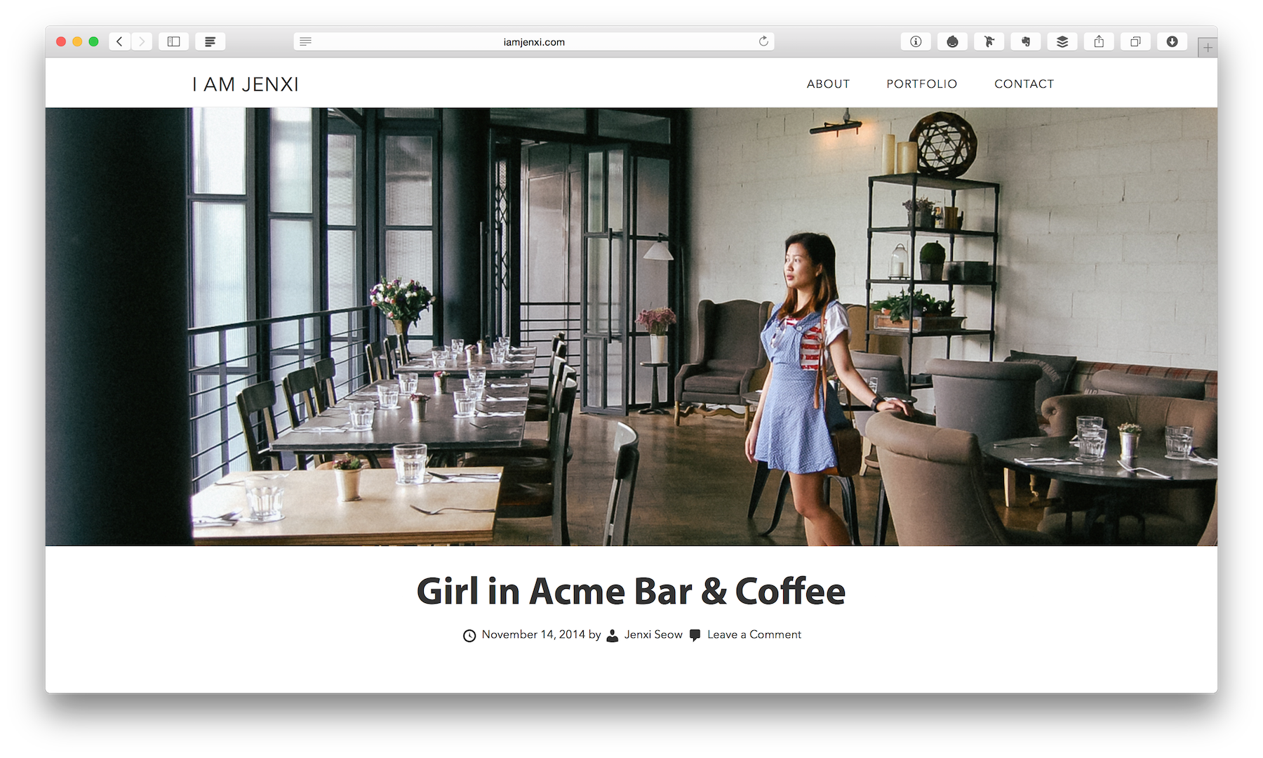
Full-width designs are in fashion now for a good reason. It gives a lot of visual impact, especially when you are viewing the site on a large screen on desktop or laptop. It is a very immersive experience and it is something I wish for readers to enjoy, especially photographs are an important elements of my blog entries. I have managed to get the design to work well for both text only and image rich posts.
Change is the constant
I like the way it is set up so I can easily switch between full-width images or making the images snap to the column. The images on this post are styled with the latter. This flexibility will help me better present my entries visually. Once size fits all doesn’t work all the time. Sometimes we are forced to fall back to a single solution, especially when dealing with clients with limited technical abilities to handle custom functions. On my personal blog, I get to go crazy and try all sorts of bells and whistles.
It is very likely that you will see more changes a few months later, or even in mere weeks. I believe it is very common with web designers’ personal websites. Our blogs often become our test beds to experiment with. The changes reflect a shift in our design tastes and are a sign that we are picking up new tricks.
I hope you enjoy this latest tweak.
Leave a Reply